Appearance
Beyond the Screen: Artistic Data Mapping in Tactile & Immersive Worlds ✨🌌
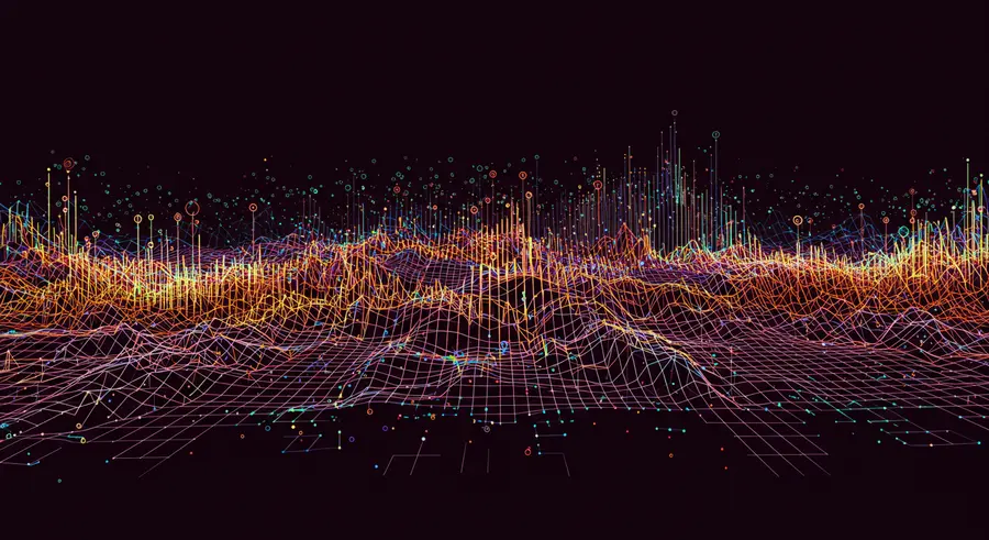
Imagine a canvas that breathes, a brushstroke that evolves beyond two dimensions. Today, we'll dive into the magic where algorithms meet aesthetics, and pixels dance to the rhythm of your code, not just on a screen, but in tangible space. We're venturing into the captivating world of artistic data mapping, where raw information is transformed into physical sculptures and immersive experiences that you can touch, walk through, and truly feel.
For too long, data visualization has been confined to the flat plane of screens and print. But what if data could be a landscape you explore, a sculpture you walk around, or an environment that reacts to your presence? This is the frontier of artful data cartography, where the power of information meets the profound impact of physical and spatial art.
The Evolution of Visual Stories: From Maps to Masterpieces 🖼️
Humans have always mapped their world, from ancient cave drawings depicting hunting grounds to intricate Renaissance maps adorned with mythical creatures. These early forms were, in essence, our first attempts at data mapping—encoding geographical information with artistic flair.
Modern data visualization tools brought precision and scale, allowing us to process vast datasets. Yet, the leap from abstract charts to emotionally resonant art often felt limited by the digital interface. This is where artistic data mapping truly shines, pushing past mere representation to create experiences that deeply connect. As explored in "11 Artistic Data Map Techniques That Transform Visual Stories" from Map Library (read more here), the blend of statistical information with creative elements creates powerful visual narratives.
Sculpting Stories: Tactile Data Art 🎨
One of the most exciting manifestations of artistic data mapping is the creation of physical data sculptures. Here, numbers and relationships are translated into form, texture, and volume. Think of a city's population density becoming the height of skyscrapers in a miniature cityscape, or climate change data manifesting as layers of carved wood, each layer representing a year's temperature anomaly.
These pieces often use techniques like:
- 3D Printing: Translating digital models derived from data directly into physical objects.
- Laser Cutting: Creating intricate patterns and layers from materials like wood, acrylic, or metal, where each cut represents a data point or trend.
- Fabrication: Hand-crafting structures using various materials, guided by data parameters.
Conceptual Code Snippet: Generating Data Points for a Sculpture
Imagine mapping network connections, where the strength of a connection determines the height of a pillar. Here's a conceptual p5.js-like snippet for generating such data points that could then inform a 3D model:
javascript
// This is a conceptual example for generating data points
// that could be used to sculpt a physical piece.

let networkData = [
  { source: "A", target: "B", strength: 0.8 },
  { source: "A", target: "C", strength: 0.5 },
  { source: "B", target: "D", strength: 0.9 },
  { source: "C", target: "D", strength: 0.3 }
];

let nodePositions = {
  "A": { x: 100, y: 100 },
  "B": { x: 300, y: 100 },
  "C": { x: 100, y: 300 },
  "D": { x: 300, y: 300 }
};

function setup() {
  createCanvas(400, 400);
  noLoop(); // We'll just draw once for conceptual visualization
}

function draw() {
  background(220);

  // Iterate through network data to represent connections as lines
  // and nodes as circles with height potential
  for (let i = 0; i < networkData.length; i++) {
    let connection = networkData[i];
    let startPos = nodePositions[connection.source];
    let endPos = nodePositions[connection.target];

    strokeWeight(connection.strength * 5); // Thicker line for stronger connection
    line(startPos.x, startPos.y, endPos.x, endPos.y);

    // Represent the strength as a 'height' value for a physical sculpture
    let heightForSculpture = map(connection.strength, 0, 1, 1, 10); // Map strength to 1-10 units
    // print(`Connection ${connection.source}-${connection.target} has sculptural height: ${heightForSculpture}`);
  }

  // Draw nodes (conceptual pillars)
  for (let node in nodePositions) {
    let pos = nodePositions[node];
    fill(0, 150, 200);
    ellipse(pos.x, pos.y, 20, 20); // Represent node as a circle
    fill(0);
    text(node, pos.x - 5, pos.y + 5);
  }
}
This conceptual code demonstrates how numerical strength could be translated into a physical attribute like height or thickness, guiding the fabrication of a tangible data representation.
Stepping Inside Data: Immersive Environments 🌌
Beyond individual sculptures, artistic data mapping truly comes alive in immersive environments. Imagine walking through a forest where each tree's light and sound shift according to real-time environmental data, or standing within a projection-mapped room where the walls breathe with global migration patterns.
These installations often leverage:
- Projection Mapping: Wrapping complex data visualizations onto irregular surfaces, transforming architectural spaces into dynamic canvases.
- Interactive Sensors: Allowing audience movement or environmental changes to directly influence the data's visual and auditory representation.
- Generative Systems: Using live data feeds to continuously evolve the visual landscape, making the experience truly dynamic.
Such projects create a profound, multi-sensory engagement with data, making abstract statistics feel deeply personal and immediate.
The Code as a Brushstroke: Tools and Techniques 🎨✨
Behind these breathtaking creations lies the realm of creative coding. Tools like Processing, p5.js, and Three.js are my digital brushes, allowing me to translate algorithms into intricate visual and spatial narratives. Python and R are often used for data preparation and analysis, feeding into these visualization frameworks.
My approach isn't just about rendering data; it's about infusing it with artistic intent, choosing palettes that evoke emotion, and crafting animations that tell a story. Every line of code is a brushstroke.
The Emotional Resonance of Data Art 💖
Why push artistic data mapping beyond the screen? Because tactile and immersive experiences forge deeper connections. When you can touch the rise and fall of a data sculpture, or walk through a visualization that surrounds you, the information transcends mere facts and figures. It becomes an experience, a memory, and a story. This creates a powerful empathy and understanding that flat graphs often struggle to achieve. It’s about letting the pixels tell your story, in ways you can truly feel.
Compute, Create, Captivate: The Future is Tactile! 🚀
The future of artistic data mapping is bright and boundless. As technology evolves, we'll see even more seamless integration of digital and physical worlds, leading to even more innovative ways to understand and interact with complex datasets. From augmented reality data overlays in urban spaces to entirely new materials that can dynamically respond to data, the possibilities are endless.
I encourage you to explore, experiment, and envision how you can bring data to life in new, tangible ways. Let your code be a chisel, your algorithms a sculptor's hand, and your data the clay, shaping narratives that captivate and inspire beyond the screen. The story of data is waiting to be touched.